


Knowledgebase articles
- Welcome to the Knowledge Base
- Introduction
- Getting Started
- Preferences
- Activities
- Cases
- Introduction to Cases
- Displaying & Adding Cases
- Managing Cases
- Using the Case Portal
- Email
- Importing Data
- Leads
- Marketing
- Introduction to Marketing
- Event Management
- Compliance Records
- Spotler Integration
- What is Spotler?
- Navigating your Spotler homepage
- Introduction to GatorMail
- GatorMail Configuration
- Sending Emails in GatorMail
- Advanced Features
- Setting up the Plugin
- Viewing Web Insights Data on your Form Layouts
- Domain Names and Online Activities
- Reporting incorrect Leads created through Web Insights
- Reporting on Web Insights data
- Using UTM Values
- Why aren’t Online Activities being created in the database?
- Why is GatorLeads recording online activities in a foreign language?
- GatorSurvey
- GatorPopup
- Integrations
- SFTP/FTP Processes
- Mapping
- Docusign Integration
- DocuSign Functionality
- Adobe Sign Integration
- Zapier
- Introduction to Zapier
- Available Triggers and Actions
- Linking your Workbooks Account to Zapier
- Posted Invoices to Xero Invoices
- Xero payments to Workbooks Tasks
- New Case to Google Drive folder
- New Case to Basecamp Project
- New Workbooks Case to JIRA Ticket
- Jira Issue to new Case
- 123FormBuilder Form Entry to Case
- Eventbrite Attendee to Sales Lead and Task
- Facebook Ad Leads to Sales Leads
- Wufoo Form Entry to Sales Lead
- Posted Credit Note to Task
- Survey Monkey responses to Tasks
- Multistep Zaps
- Email Integrations
- Microsoft Office
- Auditing
- Comments
- People & Organisations
- Introduction to People & Organisations
- Using Postcode Lookup
- Data Enrichment
- Reporting
- Transaction Documents
- Displaying & Adding Transaction Documents
- Copying Transaction Documents
- Transaction Documents Fields Help
- Transaction Documents Line Items Help
- Printing & Sending Transaction Documents
- Managing Transaction Document Currencies
- Managing Transaction Document Statuses
- Setting a Blank Default Currency on Transaction Documents
- Credit Notes
- Customer Orders
- Invoices
- Quotations
- Supplier Orders
- Sagelink
- Configuration
- Workbooks Support: Your Go-To Guide
- Releases & Roadmap
Introduction to Charts
Workbooks includes the ability to create Charts from a Report so that reports can be easily displayed visually as well as in a grid format. Charts can then be added to Dashboards, or sent out through Scheduled Emails.
The “Chart this View” option on a report allows you to visualize your data using different chart types. When you select Chart this View, Workbooks displays a menu ( as shown in the screenshot below) where you can choose from various chart options to best represent your data.
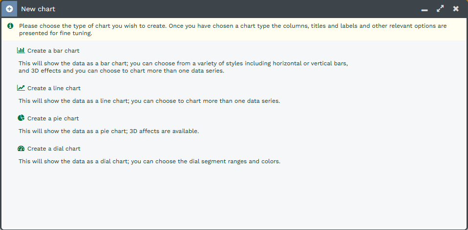
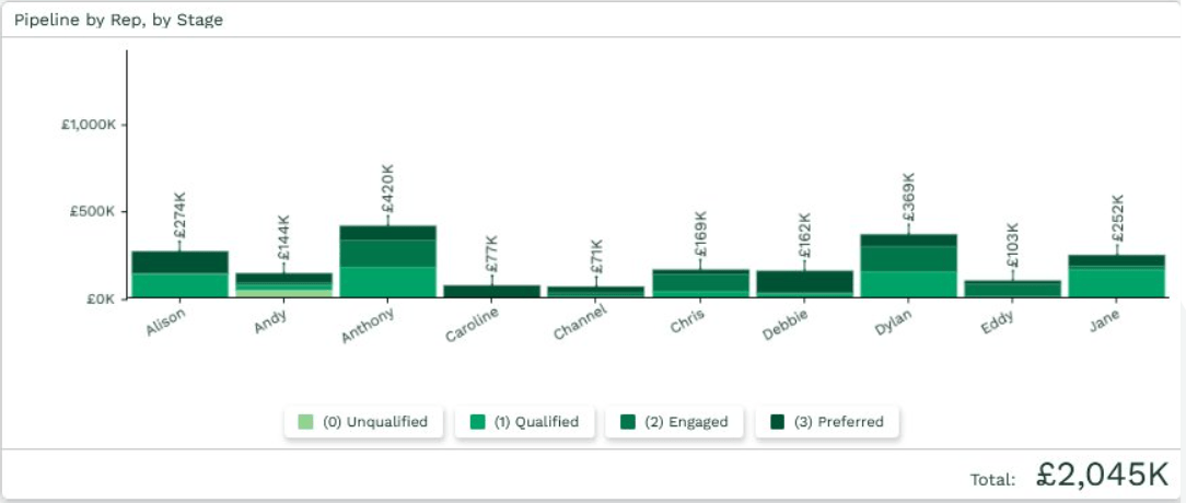
Bar Charts – Bar Charts are ideal for tracking performance of a Team or individual performance. Bar Charts can also include targets, allowing you to see the performance against target visually.
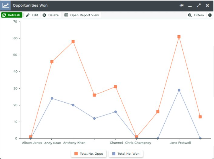
Line Charts – Line Charts allow you to better track trends over time; these work well for reports that use a Split column, as multiple lines can be represented on a single chart for easy comparison.
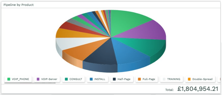
Pie Charts – Pie Charts allow you to see data as proportions of a total, such as when comparing the different sources that Cases or Leads were created through, and are useful to understand where resources may need to be allocated.
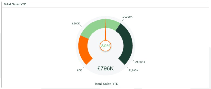
Dial Charts – Dial Charts let you see where you are against an overall target; these can be generated from a Summary View, such as the total value of won Opportunities against an annual Target.
NOTE: Following the guide on another Knowledge Base article here will show how to add charts and elements to Dashboards.