


Setting Up Card Views
To help users focus on the important pieces of information in your system and to provide a crisp, cut-down version of the data, you can use Card View.
This shows the fields in an easy-to-use read-only summary, which can be expanded in an editable view. Card View can also include an image on the left-hand side and one or more ‘action buttons’ for easy access to:
- Telephone numbers – which can be clicked to make a call (if VOIP integration has been set up).
- Email addresses – these can be clicked to open an email record, either within Workbooks or within your standard email client.
- Associated records – for example, you could click to open a Person’s employer record.
- Map position – opens the map for the associated location.
When displaying fields in Card View you can configure them to be prefixed with or exclude the Field Label. If the field has an action button it’s also possible to hide the value from the text but still show the value in the button.
Note
If the field added to the Card View is empty, neither the Field Label nor the empty field will visible in the collapsed view but they will show when the Card View is expanded.
It’s also possible to configure the Card View’s title to be a value from a field, for example, you can configure the card to use the Person’s name as the title.
Action buttons will show at the bottom of the card, except the Map Position, which will show in the top right-hand corner. If the section that the Card View uses contains more than one Map Position, the one from the first field detected will be used.
Each Card View can contain one image of up to 10MB in size, which will display on the left-hand side in a square or circle, with or without a border. If the section that the Card View uses contains more than one image, the one from the first image field detected will be used.
Card Views can include Report Cell fields (and will retain any formatting previously applied to the cell) but other types of Report Custom Fields will not be shown in the Card View.
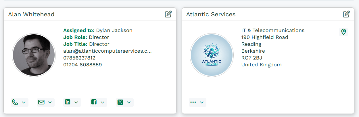
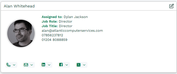
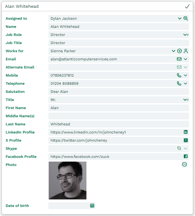
The first screenshot below shows a Person record in a collapsed Card View and the second one shows the same record when the Card View has been expanded to reveal the underlying fields in editable mode.
Setting Up Card View
Card View is set up in the same way as any other section used in Form Layouts. You add all the fields you want to see in the expanded view and in the order you want to see them. The difference is that you specify whether the field should also appear in the cut-down Card View. There are two steps involved:
- Setting up your Card View Section.
- Adding Fields to your Card View Section.
Setting up your Card View Section
Imagine you want to set up a Card View similar to the one for a Person shown in the screenshots above. Navigate to Start > Configuration > Customisation > Record Types > People. Open the Form Layouts tab where you can select either an existing Form Layout or create a new one. Either way, with the relevant Form Layout open, open the Sections tab. You can add a new Section or modify an existing one to show as a Card View.
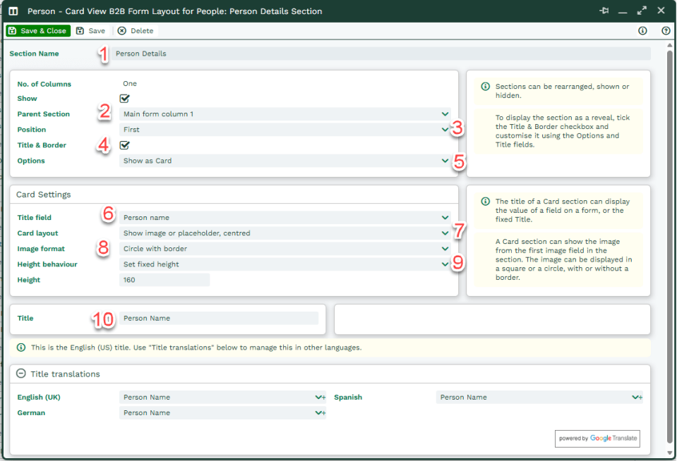
- Give your Section a name. This is only visible to System Administrators looking at the Form Layout but nonetheless, we’d advise giving it a self-explanatory name based on the type of fields you’re going to put into the Section.
- Select the Parent Section within which you want your Card View to appear.
- Select where within the Parent Section you want your Card View to appear.
- To create a Card View rather than a ‘normal’ section, you MUST tick the ‘Title and Border’ checkbox.
- Within Options, select ‘Show as Card’. Doing this will cause a new section to appear on the dialogue box, entitled ‘Card Settings’.
- If you want the value in one of the fields from your record to act as the title of the Card View (which will make it appear at the top left of the Card View), use the dropdown picklist to select the appropriate field. Our recommendation would be (where possible) to select a mandatory field to ensure that every record displays this value (see step 10 below).
- The default setting here is ‘Show image if present, no placeholder’, which means the first image in your Section will show on the left-hand side of the Card View and the other fields will be indented slightly to the right. If you want an image to appear in your expanded Card View but not on the Card itself, select ‘No image, left aligned’. If you want an image to show, and for it to use a placeholder image when no image has been uploaded, choose ‘Show image or placeholder, centred’.
- If your Card includes an image it can be displayed as a square or a circle, with or without a border, so choose your preferred option.
- By default, the Height behaviour field is set to ‘Fit content’, which means the height will grow to match the content. If you prefer, you set a minimum or a fixed height. Choosing a fixed height is useful if you want to configure two Cards side by side so that they line up. If there’s too much data in the Card to be displayed within the fixed height a scroll bar will appear.
- The Title field is mandatory, even if you’ve already specified a value within the field labelled Title field. This is so that if the field you want to display at step 6 above is empty, the value entered here will display instead. If you haven’t specified a field at step 6 then the value you enter here will always show.
You can now click Save & Close.
Adding Fields to your Card View Section
Once your Card View Section has been created and saved, navigate to the Fields tab on your Form Layout. Work through the fields you want to add to the section, making sure you select ALL the fields you want to see when the Card View is expanded, not just the ones you want to see when it’s collapsed.
Make sure you add the Field to the relevant Card View Section and specify the position in that Section where you want to see the Field.
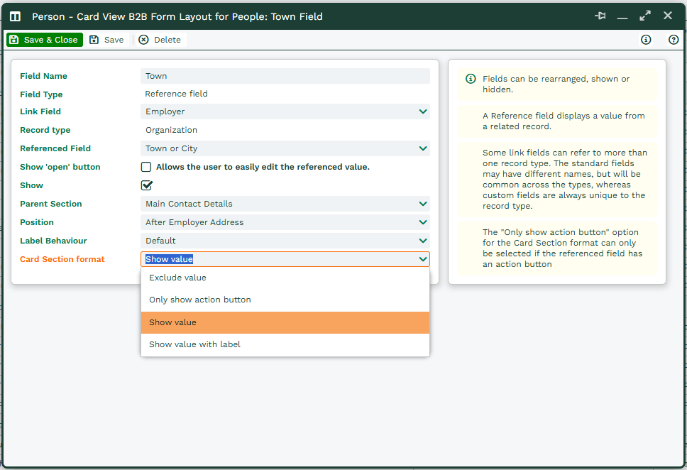
The Card Section format field controls the behaviour of the collapsed versus the expanded Card View:
- Exclude value’ – select this if you only want to see the Field in the expanded Card View.
- ‘Only show action button’ – you will only see this option if the Field you’re positioning is one of the following Fields: Telephone; Email; Social Media; Map Position; Associated Record (eg, the Employer Field on a Person record, or the Prospective Customer on an Opportunity). This will show a clickable button at the bottom of the Card except for the Map Position, which will show a button in the top right-hand corner of the Card.
- ‘Show value’ – this will display the value of the relevant Field on the Card. If the Field you’re positioning is one of the following Fields: Telephone; Email; Social Media; Associated Record, an action button will also display.
- ‘Show value with label’ – this will display both the Field Label AND the value of the relevant Field on the Card. If the Field you’re positioning is one of the following Fields: Telephone; Email; Social Media; Associated Record, an action button will also display.
* Remember, if the Field doesn’t contain a value, nothing will display on the Card, not even the label.