


Dial Charts
Dial charts are a great way of being able to display your progress against a target.
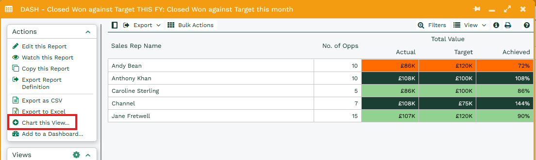
Once you have run the Report you will have the option to Chart this View, selecting this will generate a new window.
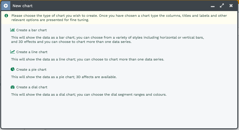
From this window you can select the type of chart you wish to create, to Create a dial chart select the Create a dial chart option.
Settings
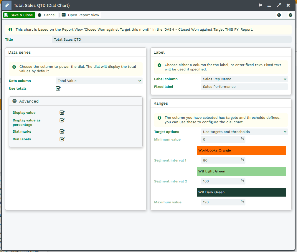
Data Series
Data column – The column from the report that will be used in the chart, this will be a numeric value column.
Use totals – if ticked, the Dial Chart will take the values from the Grand Total row of your report, instead of the report row itself. This means you do not need to create a new Summary View to output the totals.
The below images show the difference, where the first image does not have the ‘Use totals’ box ticked and therefore uses the data from the first row of the report, vs the second where the ‘Use totals’ box is ticked and the chart is using the Grand Total. The first therefore works best if built from a Summary View with a single row for the total.
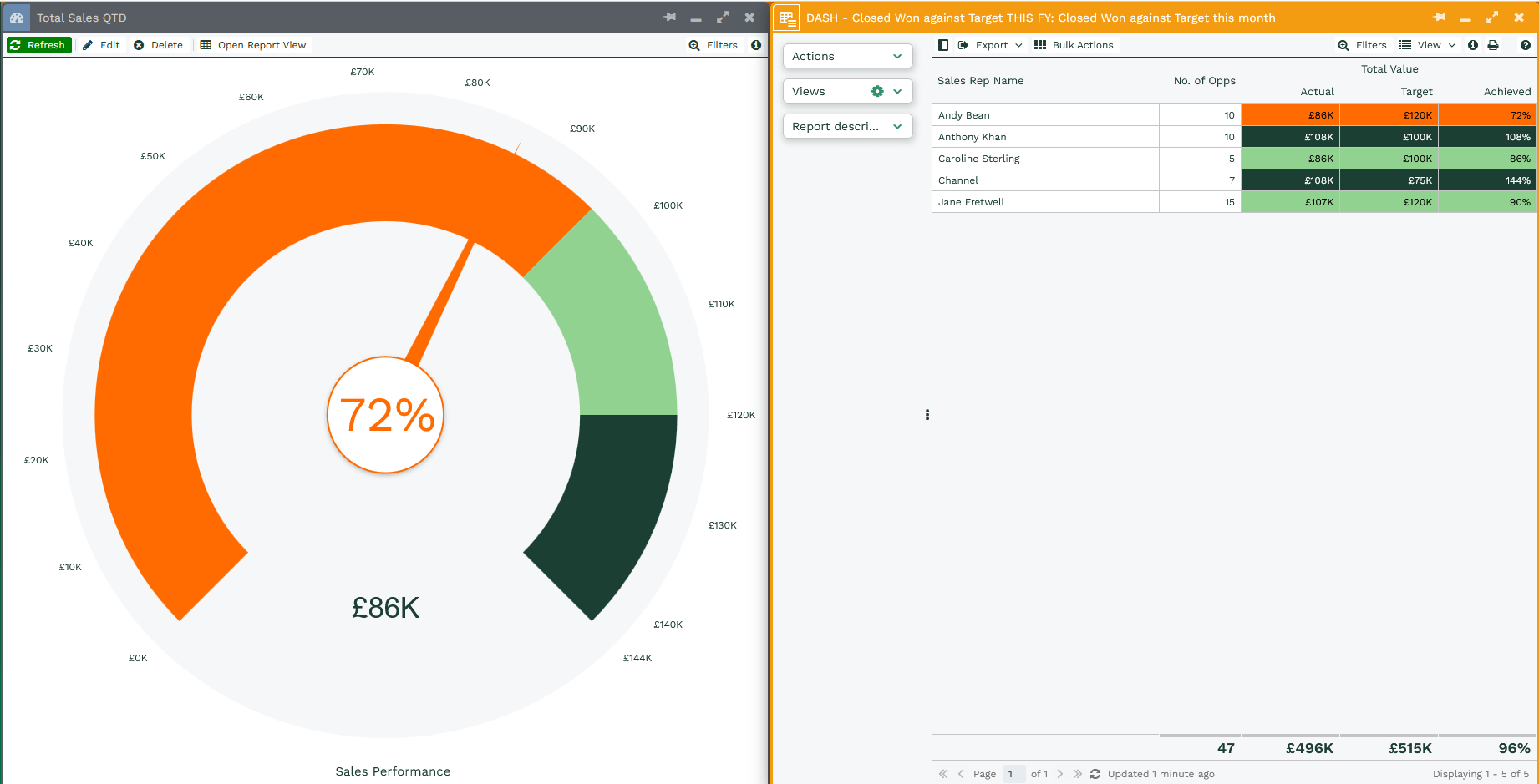
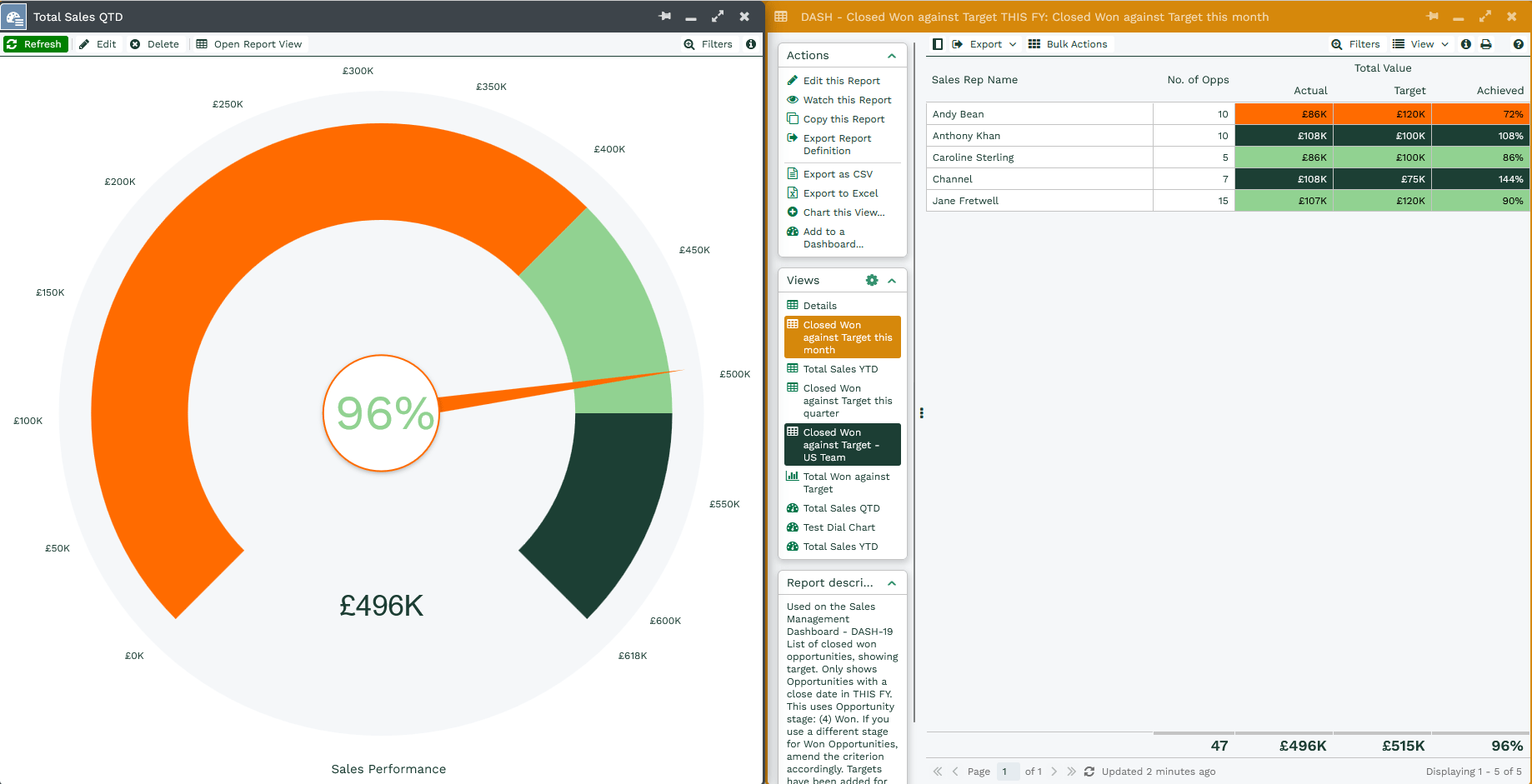
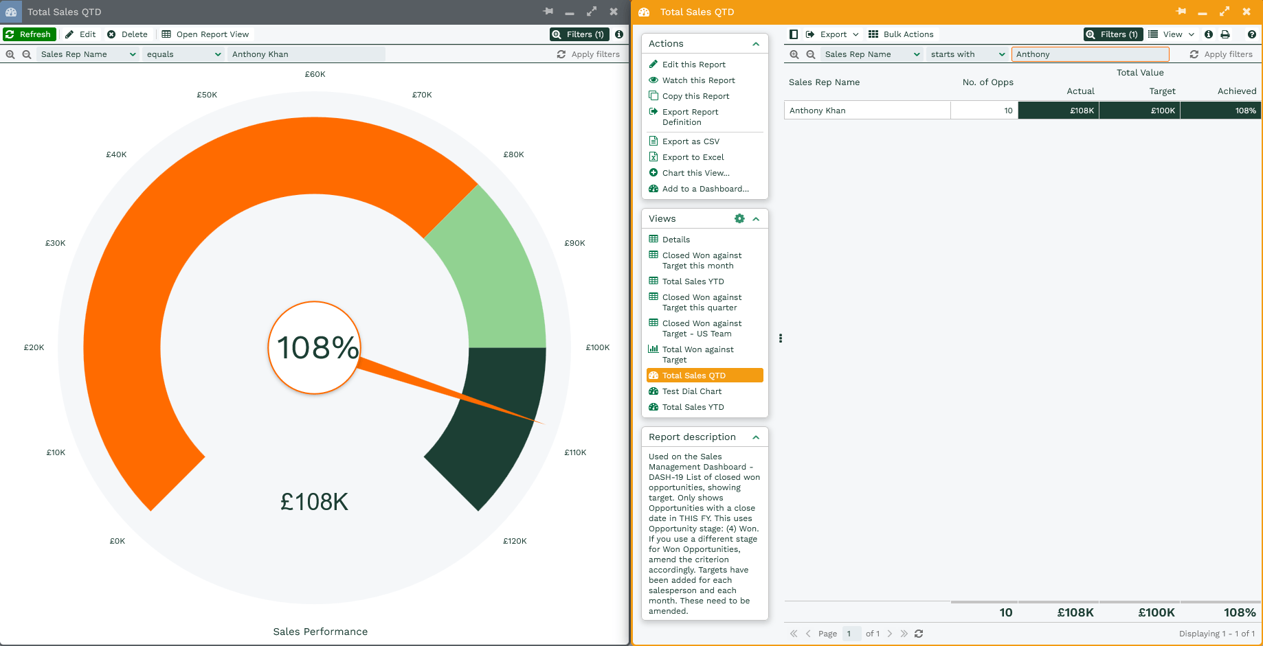
A further benefit to using the ‘Use totals’ setting is that you can then apply filters to the Dial Chart and it will adjust accordingly, as per below. This works well with Dashboard filters.
Advanced
Display value – Choose whether you want the value from the report to be displayed in the centre of the dial.
Dial marks – Choose whether marks appear around the edge of the dial.
Dial labels – If ‘Dial marks’ are enabled you are then able to show labels which display the numeric values at each of the marks.
Ranges
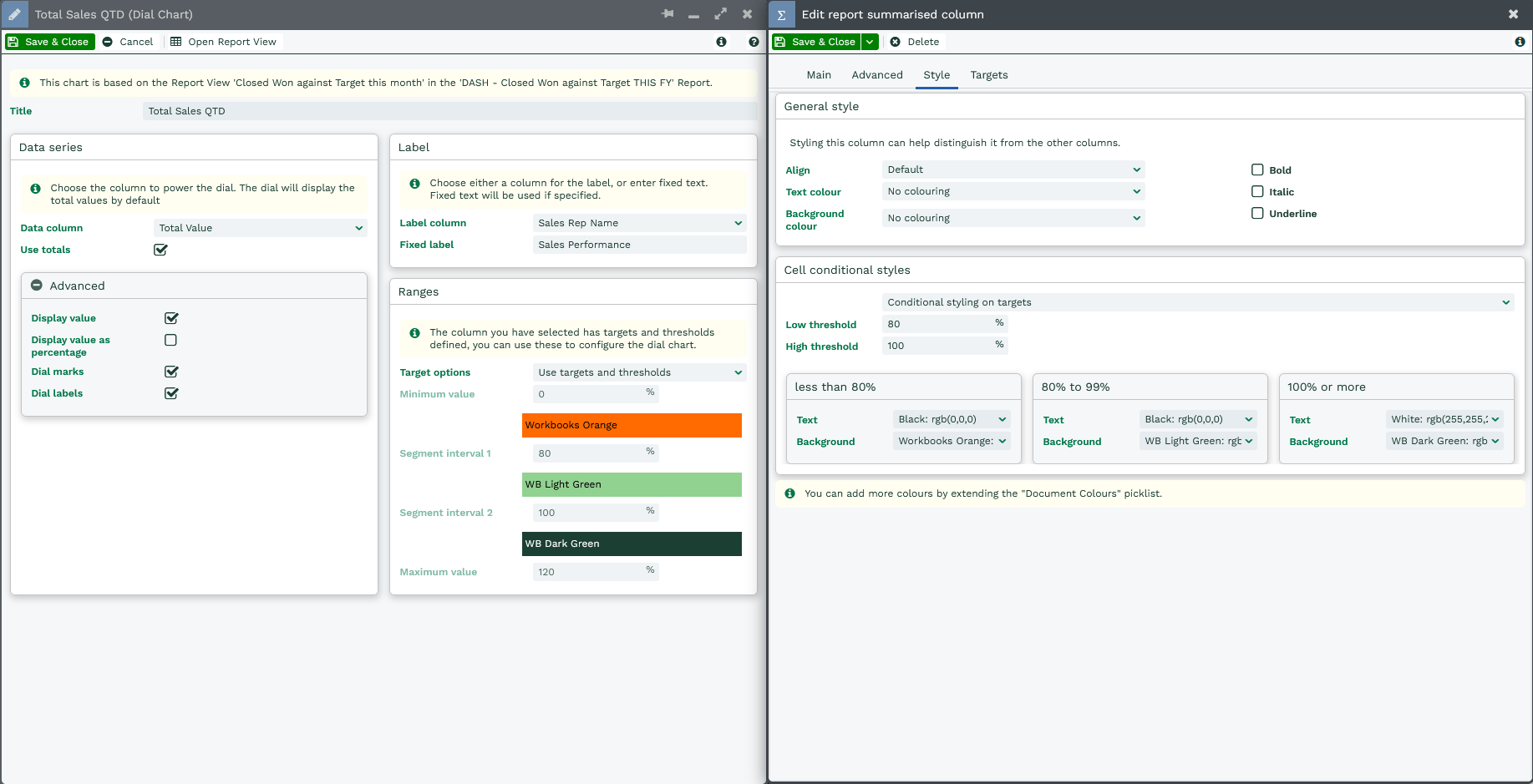
Target options – Choose whether you want to manually pick the range of each segment of the dial chart, or whether it should pull them from the targets and thresholds of your report column:
- Default – allows you to manually set the range of each segment of the dial chart, and is fixed to use Red Amber Green as the colours.
- Minimum Value – Select the minimum value of the dial, this is where the dial will start.
- Segment interval – the ‘Segment interval’ values determine when the dial changes from red to amber, amber to green or vice versa.
- Maximum Value – This is the target value that your dial is working towards
- Colour Order – Select whether you want the colours goes Red Amber Green or Green Amber Red depending on how you are using the chart.
- Use targets – allows you to set the range of each segment based on a percentage of the target specified on the Data column, and is fixed to use Red Amber Green as the colours
- Use targets and thresholds – pulls the same ranges and colours specified on the ‘Style’ tab of the Data column.